A packaging system is not the usual solution for a business-to-business e-commerce website but that’s exactly what happened when Di Marca was commissioned to reimagine the Bennetts website.
The Brief
Shortly after our rebranding work for Australia’s leading green coffee trader, Di Marca was commissioned to rethink the Bennetts website and e-commerce experience. Our brief was to align the look and feel with the newly launched brand and improve the user experience for their wholesale customers.
As part of the earlier rebranding project and strategy process, we dove deep into the business, their proud history and what makes Bennetts tick. We also spent time speaking to key customers and so were well placed to help improve their online offering. It was clear Bennetts had a great business, a wealth of knowledge, unmatched expertise, strong relationships with growers around the world and many loyal customers but their website was looking tired and didn’t reflect any of that.
Bennetts has one of the largest ranges of green beans sourced from all around the world. Discovering and ordering them via the old website wasn’t easy. The structure of the site was linked to a back-end system holding a vast amount of information on all of Bennett’s available coffees, growers and origins that even the most fastidious coffee roaster would want to know, the problem was, it wasn’t easy to find.
While the secure customer section had the potential to automate and handle a lot of ordering that was still being done over the phone, the process was clunky and not user friendly at all.
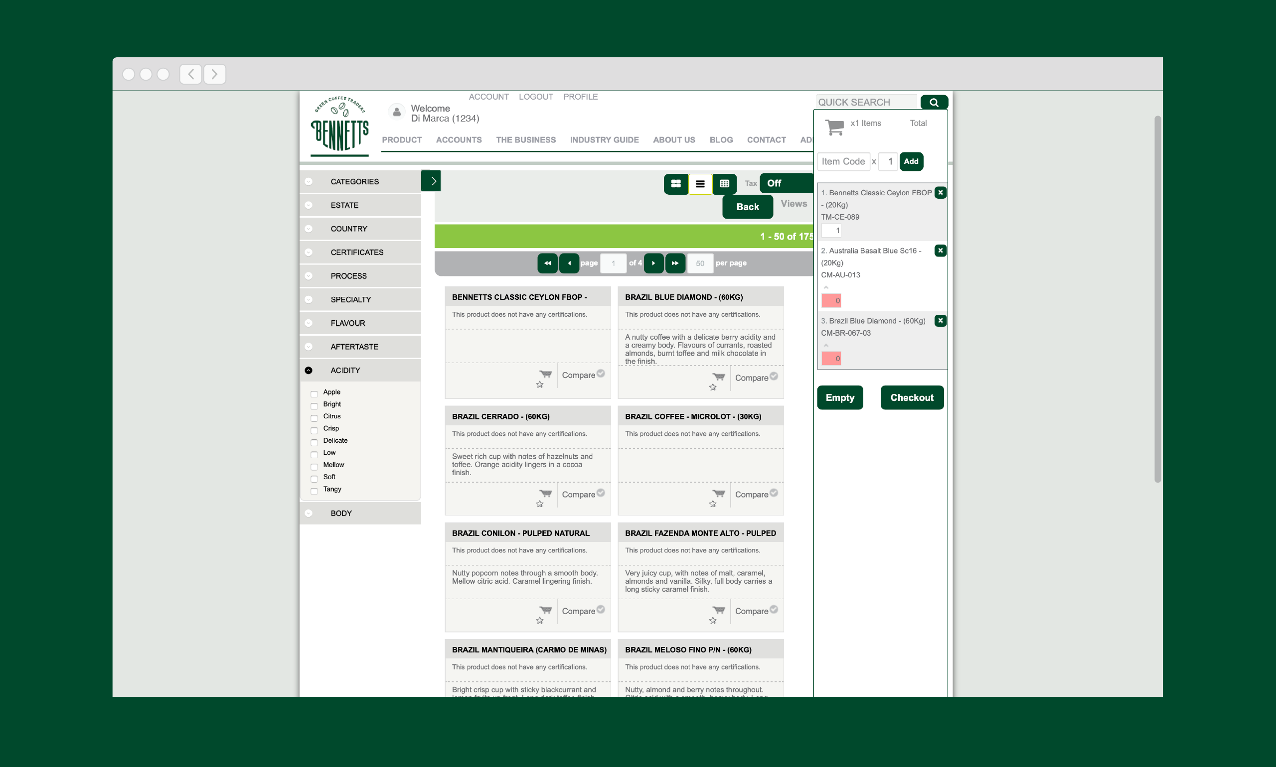
On top of the usability issues, updating listings had become a chore for the Bennetts team. The site had originally been designed to display a picture of green coffee beans and supporting descriptions but their growers didn’t have the technology to provide photos and Bennetts didn’t have the resources to photograph and upload every individual variety that came through the door, meaning that most of the time there wasn’t a picture and users were presented with pages of just text. Even when pictures were available, most green coffee beans look the same so pictures wouldn’t be a helpful way to find what roasters are looking for anyway.
We needed to find a way that would both present the information in a compelling way and make things really easy to update.
Outcome
To choose coffee beans in the real world, you would talk to your Bennetts account manager about the kind of bean you’re looking for, maybe come into their fully equipped tasting lab, hold and sniff the raw beans and sample taste the resulting roast. That’s obviously not something you can replicate online.
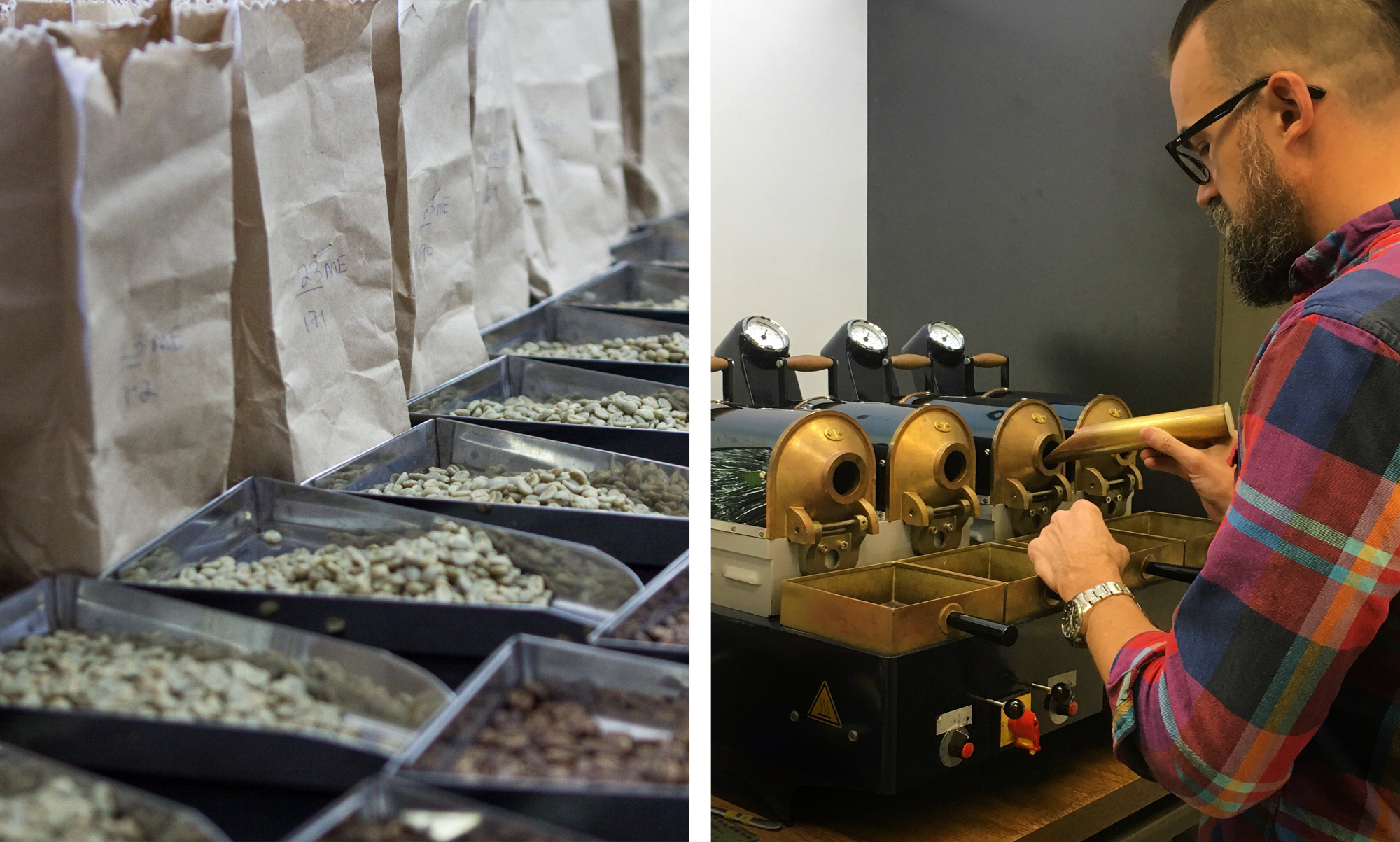
You can’t mimic the sensory experience on a website, what you can do is describe it, with as much accurate detail, knowledge and information as possible.
…and Bennetts has a lot of information and a huge inventory of stock at any given moment: country of origin, flavour profile, bag size, price per kilo, fairtrade, organic, and more …all live information that updates daily linked to inventory held in their warehouse or on a ship about to land.
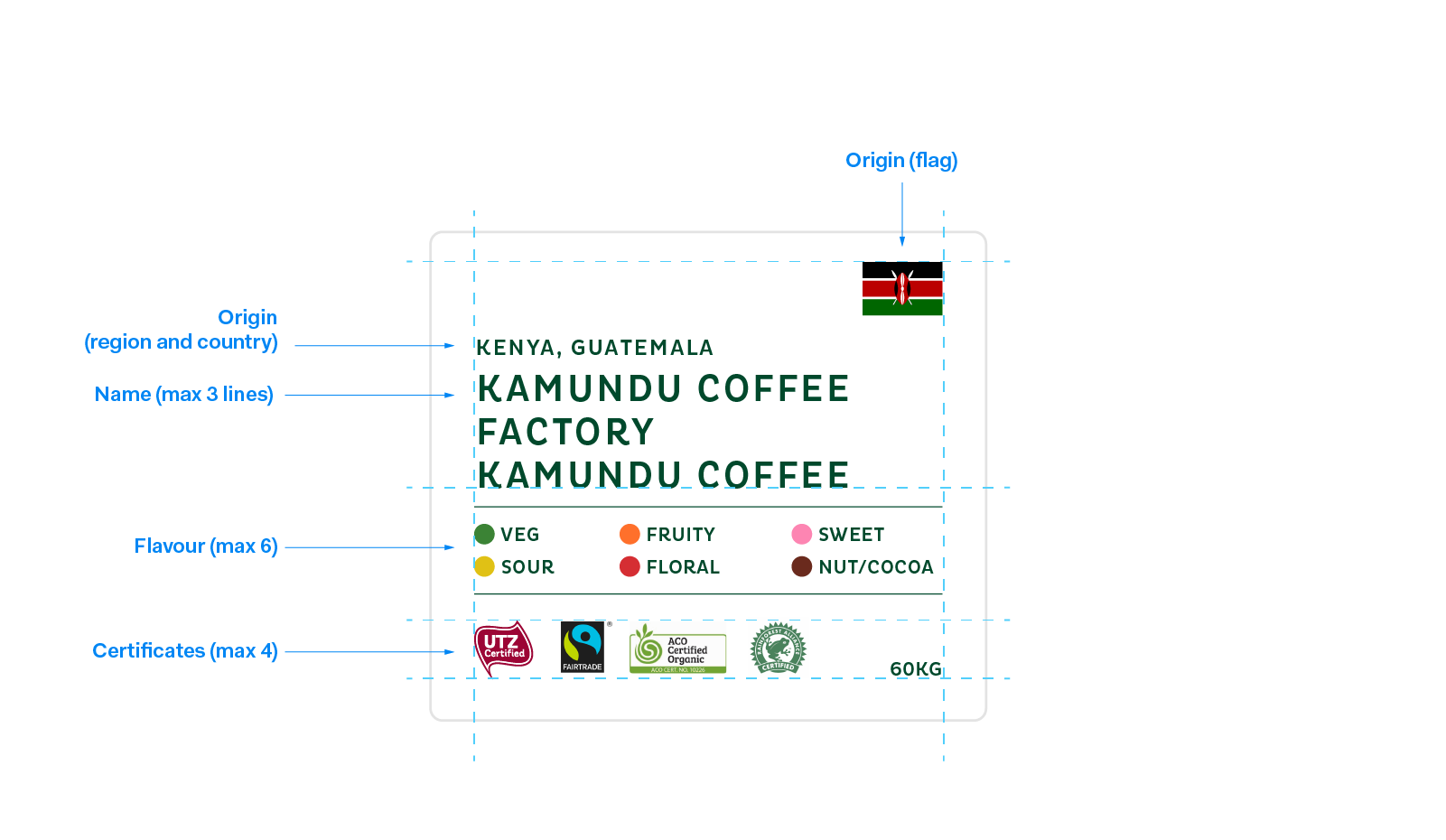
Nobody wants to scroll and scroll through vast amounts of information, even if it is important to you. We had to chunk the info down and present it in a visual way, using a small amount of space so that users could easily compare and narrow down their choice.
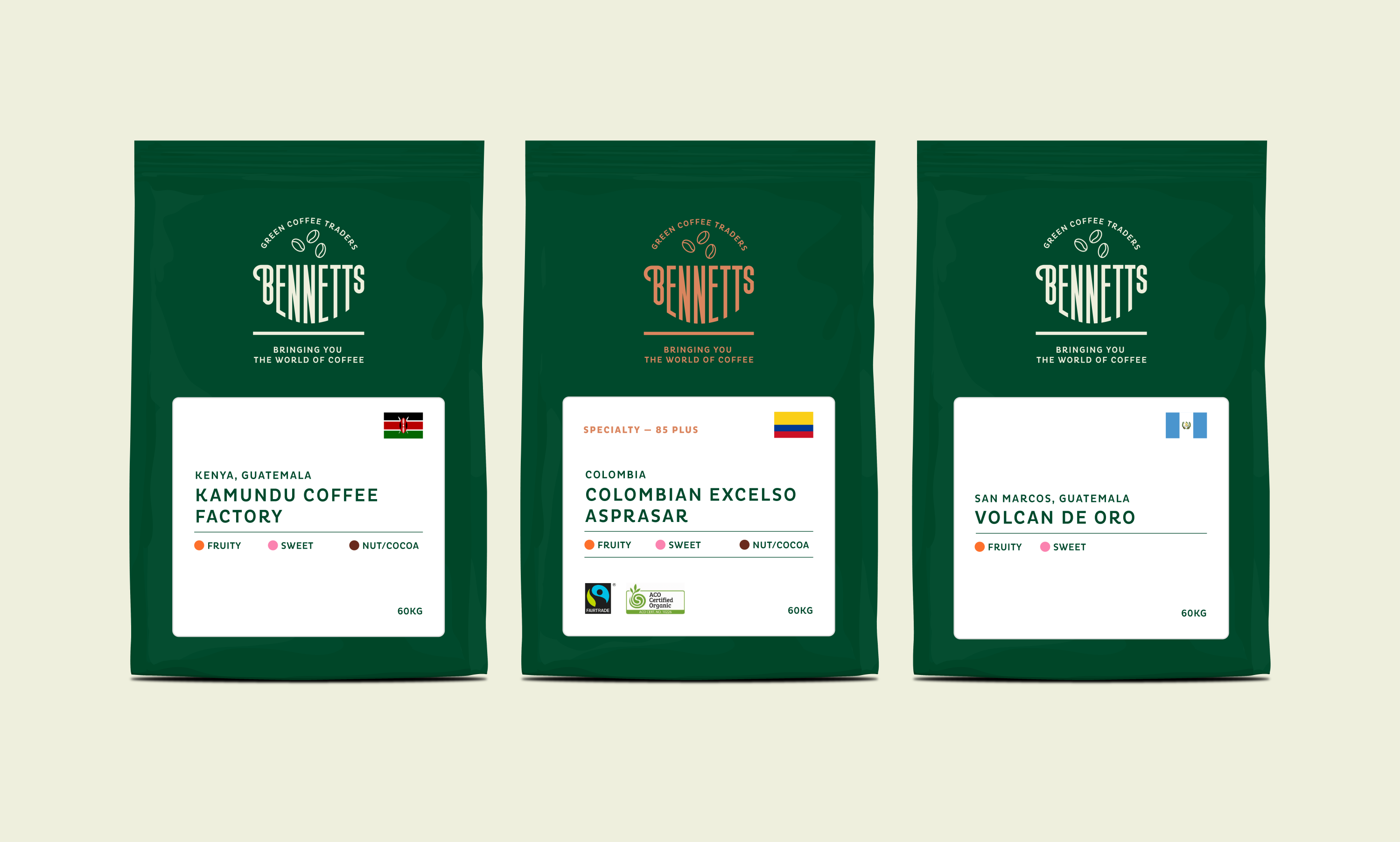
This problem sounded familiar, something we’d encountered in our many years designing retail packaging. Yes, a package of some sort would be a smart way to cluster information, visually in a small space.
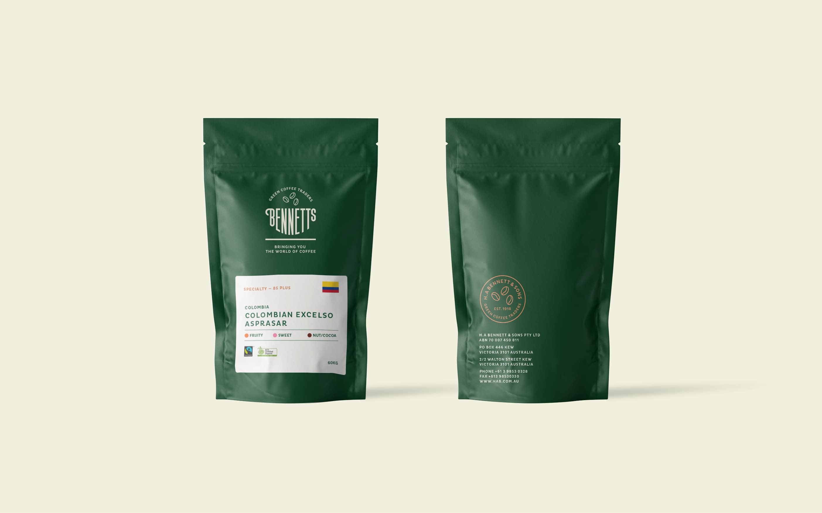
In our earlier branding work with Bennetts we designed real sample packs and started to wonder if these could somehow translate to the website.
Knowing the finished site had to work with the existing back-end technology and information already loaded into the database we wondered if the packs we were proposing could be automatically generated straight from the database. We presented our thoughts to the client at this stage and started to investigate whether or not it was feasible. Involving the Bennetts web developer at this point we tested on a development site to confirm our idea would work, once successful we designed the whole e-commerce experience of the site around this simple idea.
By using the automated packaging system many other features could be built into the site such as promotional coffees, featured varieties, high cupping score speciality beans, staff picks and other suggested coffees.
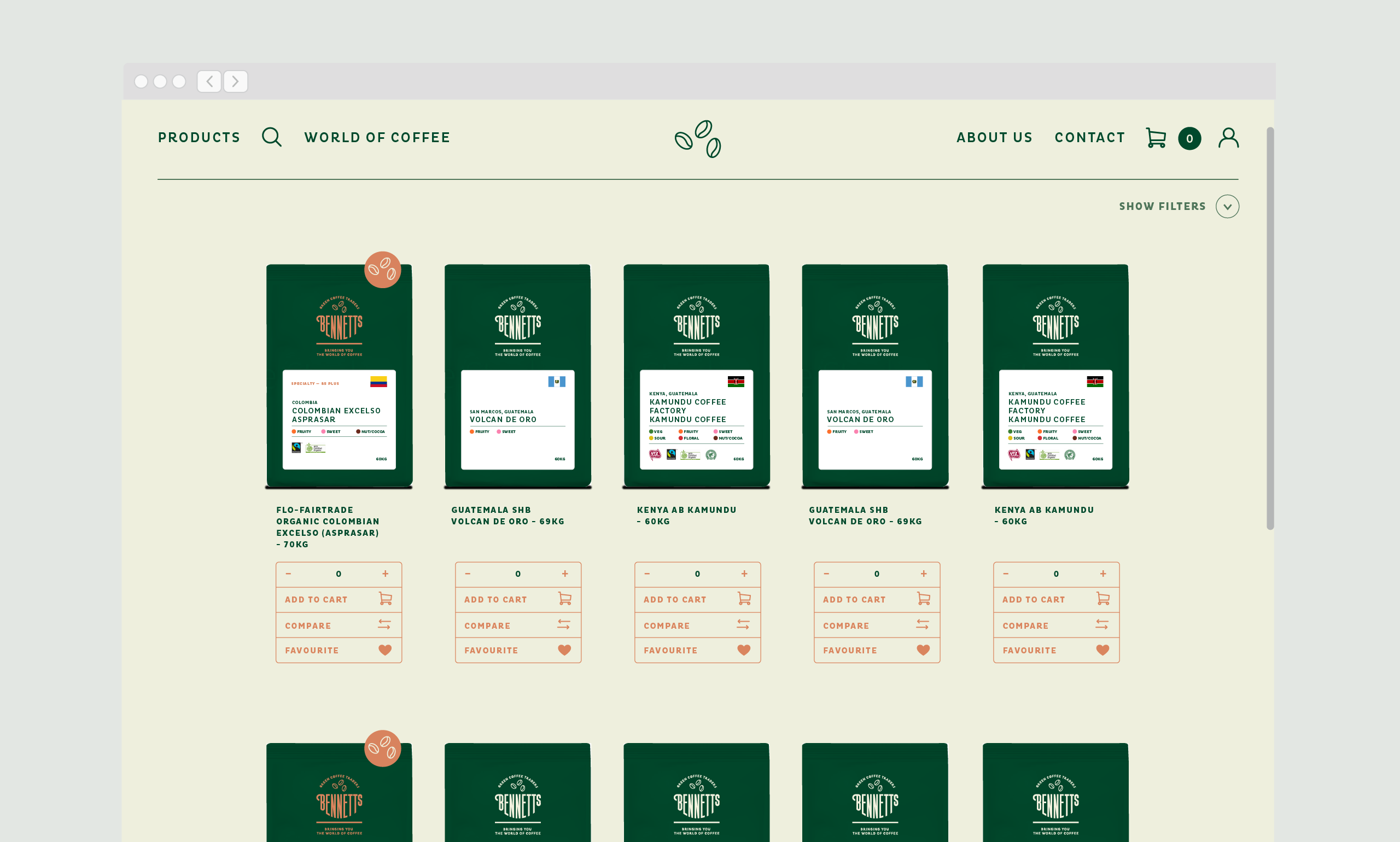
Some of Bennetts customers would be repeat orders, simply logging in and quickly reordering the same thing they always do. Other customers were always on the lookout for THAT special bean about to drop. We built in features that would be useful to both users, including: A customer dashboard, accounts section, reorder feature, watch list and favourites.
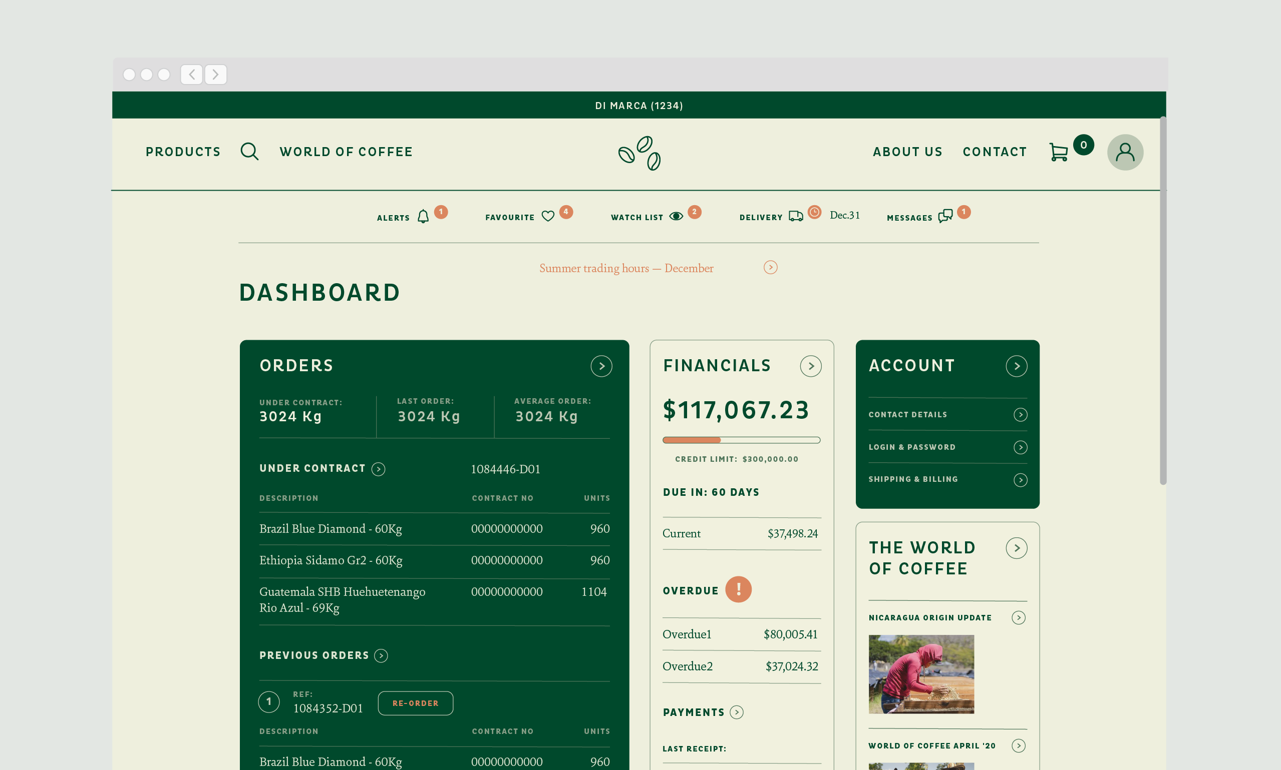
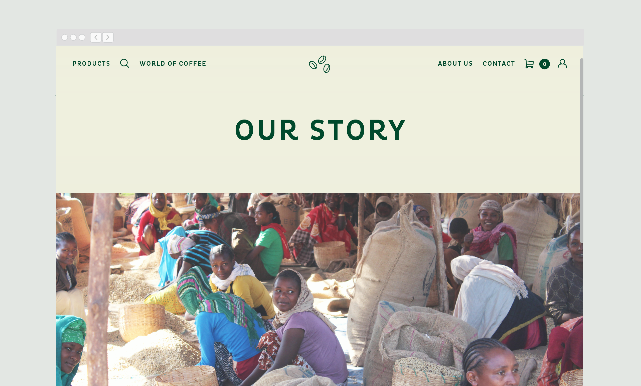
The solution was both practical and far more visually appealing for users than it was before. We designed the whole experience of the site around this simple idea.
Good design is all about thinking through a problem to come up with a compelling solution, not just a styling exercise. By using an automated packaging system to display information on the Bennetts website we were able to improve the user experience and .

