Navigating the complexity of global transport and the dilemma of how to create a sustainable future was a struggle, even for those organisations who had already fully committed to sustainability elsewhere in their supply chain.
Enter Zilch, who is revolutionising the freight forwarding industry through its commitment to zero emission logistics.
The Brief
To launch this innovative concept, Di Marca was tasked with building a compelling brand that appeals to potential customers committed to a more sustainable future.
Outcome
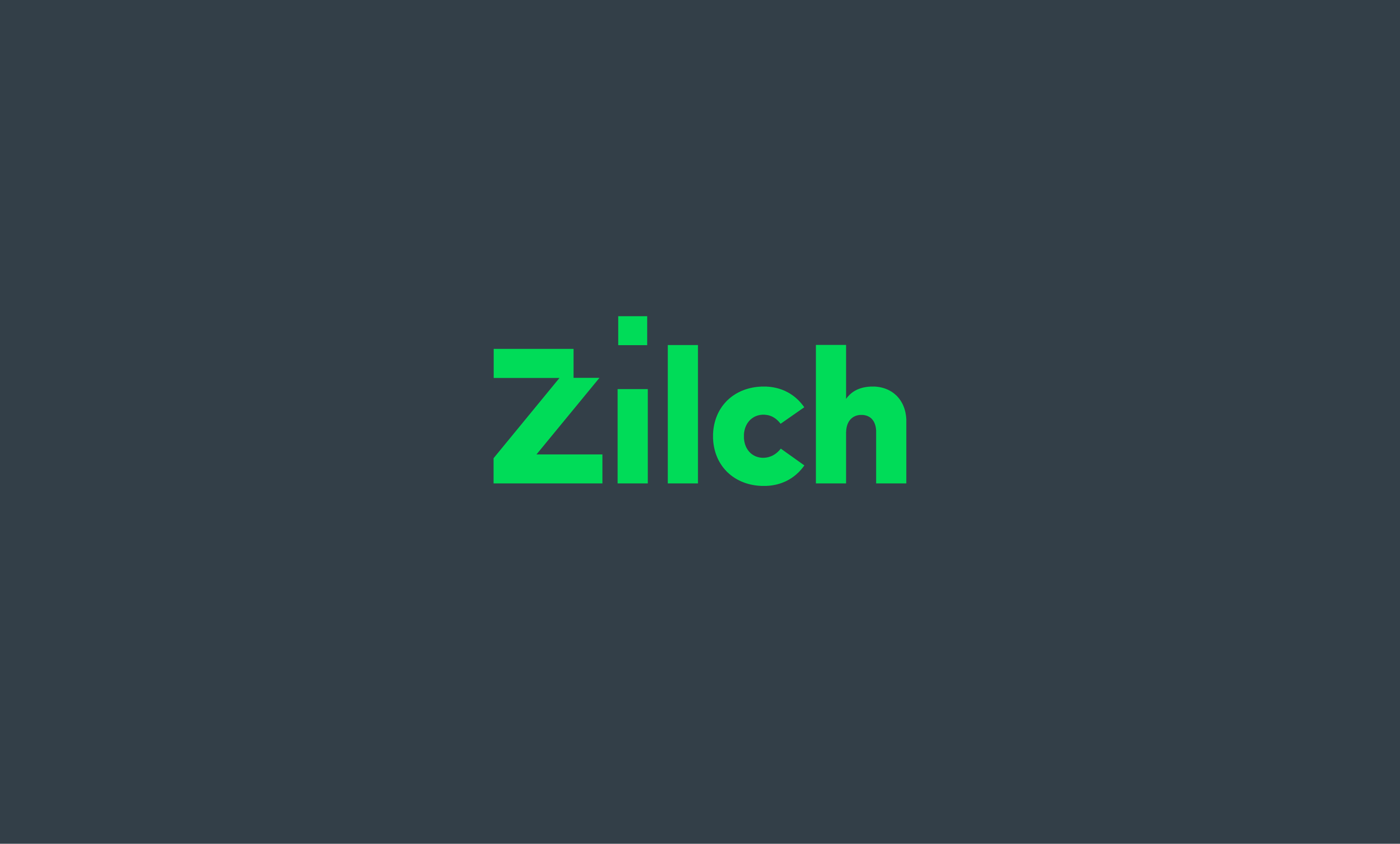
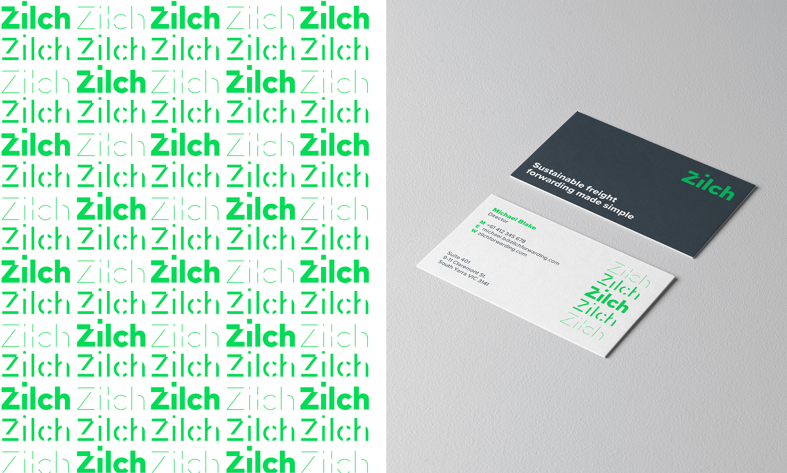
Di Marca’s strategic brand work established Zilch as the simple solution to sustainable logistics, offering cleaner pathways to market. We developed a brand appearance that speaks to the greener aspects of Zilch’s offering while expressing the confidence associated with a more established brand. The unique logo hints at the business of logistics with a tittle (the dot above the lowercase i) appearing to move from the uppercase zed and a supporting graphic was created that visualises the concept of zero emissions by showing the logo disappearing.
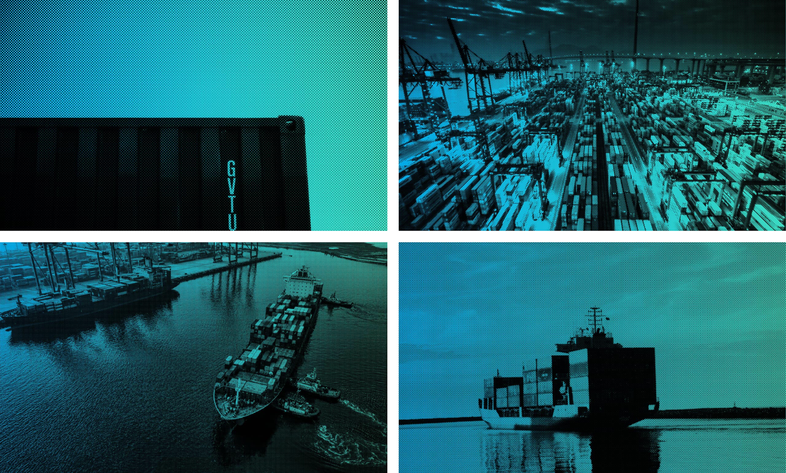
The brand appearance includes a distinctive image treatment to pair with contrasting colours. A vibrant green was chosen to signal Zilch’s game changing status, which is offset by a more subdued grey.
With the brand strategy and appearance toolkit we developed, Zilch have been able to launch with confidence and are now applying the new brand across all touchpoints. Following our initial strategic work Zilch is accelerating the transition to zero emission logistics and successfully partnering with organisations committed to a more sustainable future.
What we did:
- Brand strategy
- Brand appearance system & toolkit
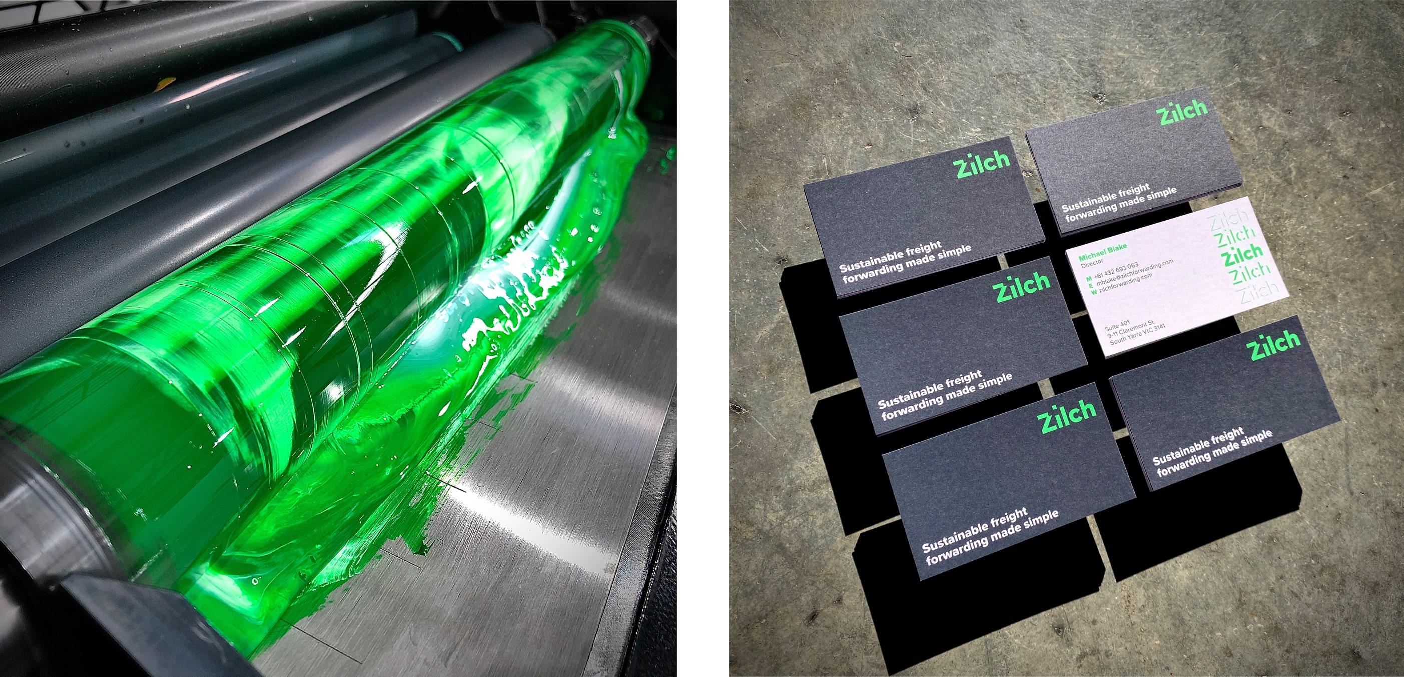
Thanks to our friends at Taylor’d Press the special-mix green really popped on the business cards.